The Future of Magazines?
Interesting interactive magazine feature created for Viv Mag, a digital magazine, for the iPad. The look of magazines to come?
[Via Vincent Laforet blog]
Interesting interactive magazine feature created for Viv Mag, a digital magazine, for the iPad. The look of magazines to come?
[Via Vincent Laforet blog]
A lot of designers I know were buzzing about this today. We all wonder if it will perform as well as it does in the video. Cross your fingers!

MoMA announced today that they have acquired the @ symbol for their collection. Read the interesting and unique reasoning behind why and how they can acquire the "at" symbol and see what you think. We aren't quite sold yet.

Behance's 99% blog has a great interview with artist, writer and illustrator Maira Kalman about her work and where she gathers inspiration and how your inspiration might be closer then you think.
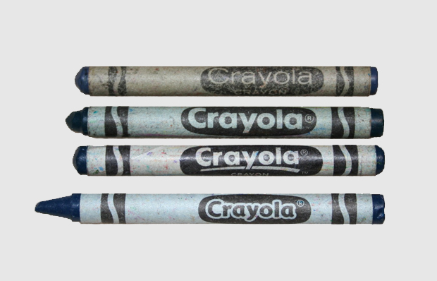
Fast Company published an article about Joshua Cohen's Triple Canopy article "The 36 Shades of Prussian Blue." Prussian Blue is considered to be the first synthetic color, created in 1704, it was a huge hit with artists as previous blues were often more expensive to obtain than gold.
[Photo features four iterations of the Crayola logo and the crayon formerly know as Prussian Blue. In 1958, the Prussian Blue crayon was renamed Midnight Blue because no one knew what or where Prussia was.]


Jonathan Alder just introduced a line of fun and funky, brightly-patterned stationery. Now you can get flirty file folders, chic pens, cheery notecards, niffy notebooks and much, much more. Everything is covered in happy candied-hued geometric patterns and 60s inspired nature patterns with birds and bunnies.


While doing a little font research today, I stumbled across the deliciously vintage fonts from Flat-It, the brain child of Japanese type designer Ryoichi Tsunekawa. There is an brief interview with Tsunekawa on MyFonts. His fonts are designed in OpenType with attention to detail including serif connections, extended character sets for European languages, ligatures and alternate characters.
The worst thing? Trying to decide which fonts I'll buy first!

The beloved NYC bookstore, The Strand, is looking for your illustrations to grace one of their tote bags. The Strand has linked up with various artists through the years to create their iconic and beautiful tote bags so don't miss the action to become part of famous alumni like Art Spiegelman, Adrian Tomine, Seth and R. Sikoryak. Be sure get your entry in by March 30th and win one of numerous awesome prizes and eternal fame.

SPD is having George Lois talk on Tuesday, March 30th at FIT to discuss his famous Esquire covers and his new book from Assouline. I've seen George Lois speak and I have to say, "DON'T MISS IT!!" He gives an amazing and inspiring (though curse-word filled) talk. Wanna see one of the original Mad Men? Then don't miss George Lois.


[All photos by Jeff Bridges from the set of Crazy Heart]
The new Tron trailer has us excited and we were happy to see the lovely and talented Oscar-winning actor Jeff Bridges in it. Speaking of Mr. Bridges, during this past week we found out that he is a huge photography geek and shoots candid photos on his movie sets which he turns into commemorative books and gives the to crew members on his films. His website has his last couple films in book form and they are lovely peek behind the scenes. We are impressed with his photography prowess and that he shoots only with a Widelux, a swing-lens panoramic camera. Jeff Bridges is truly The Dude.

Tokyo/Glow from Nathan Johnston on Vimeo.


[Lydia Deetz]
Illustrator Jonas Löfrgren created these illustrations for Lula Magazine. His web site is not live at the moment but I couldn't let these images languish until his site went live.

[Enid Coleslaw]

[Wednesday Addams]

[Margot Tennenbaum]
[Via Sarah Wynne]
Why is it that whenever I see something letterpressed I just go ga-ga? It's something about seeing the clean and fresh lines of a letterform pressed into lushious paper.
You can't help but to be in love with the work of eco-friendly letterpress shop Bella Figura.
These beautiful wedding invitations are from They donate 1% of sales to environmental causes. We print our custom wedding invitations only on 100% cotton (tree-free) paper that's made exclusively for them in a historic European paper mill.

They also use vintage cast-iron presses, the best paper, time, patience, perfection, and a whole lot of love.

Absolutely beautiful...


This week I received my first issue of Anorak magazine and I am smitten. Anorak is a British kids magazine that is the loopy, psychedelic, modern-day Highlights of today. It is chocked full of whimsical, colorful illustrations; cute stories and silly activities. The only draw-back is that it comes quarterly so I'll have to wait a couple months before I get my next Anorak fix.

For those of you missing the triumph and agonies of the Winter Olympic games, I have two Olympic tidbits for you.
First, Steven Heller created a video for the NYTimes featuring an animated analysis of Olympic icons, from the truly iconic to the questionable.
Also, Duffy & Partners has put together a collection of inspiration and information culled from the Vancouver winter games, from Inuit-inspired fashions to e-waste-based medals.

In the 4th issue of Uppercase magazine there is a story about Three Potato Four by Victoria Smith from sfgirlbybay.


Three Potato Four is ran by married couple Janet Morales and Stu Eliand and it's one of the most popular and thriving online vintage shop. I must say that I drool over Three Potato Four's collections.
The couple had two small children and love working at home so they can spend more time with them.
Cardboard boxes for the shop become forts for the kids, ... signage letters become after school alphabet lessons."


Andy Smith creates typographic illustrations that are playful and a little naive. His work reminds me of Modern Dog and YeeHaw Industries, in a good way.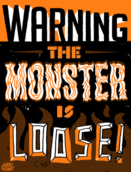

Pica + Pixel are huge fans of Milton Glaser's and it turns out we aren't alone. Last Thursday, Milton Glaser received the 2009 National Medal of Arts from Barak Obama along with eleven other recipients. Glaser was the first graphic designer ever to win the award which nation's highest award for artistic excellence overseen by the National Endowment of the Arts. Go Milton!
[Via The Daily Heller]

I wanted to let you know that the new AIGA Design Archives web site encompasses more than 20000 selections from AIGA’s annual juried design competitions dating from 1924 through the present.
In addition, it features special collections of major American design firms and practitioners whose design accomplishments might otherwise not be preserved online or made available to the public.
The collection is expected to grow by approximately 300 selections a year! 


Categories includes things like:
• book covers
• sports graphics
• ads of the year
• typography
• packaging
• political art
• and more!
The amount of information available is almost endless!
Hello! I'm Jeanee, your guest blogger for the week. I'm so happy to be here at pica + pixel to share some graphic design with you.
By day I'm a graphic designer for Hallmark and by night I'm a crafter and Zumba fitness instructor. I'm influenced by all the beauty around me, so I have lots to share!


